Imagine opening a business website on your smartphone, only to find text so tiny you have to pinch and zoom, or buttons so small you keep clicking the wrong link. Frustrating, right? Most users won’t stay on that page for more than five seconds. They will click away and head straight to a competitor.
In today’s digital world, your website is often the first handshake between your brand and a potential customer. If that handshake is clumsy, you lose business. This is exactly where Responsive Web Design (RWD) steps in.
But what exactly is it, and why has it become an absolute non-negotiable asset for businesses today? Let’s dive deep.
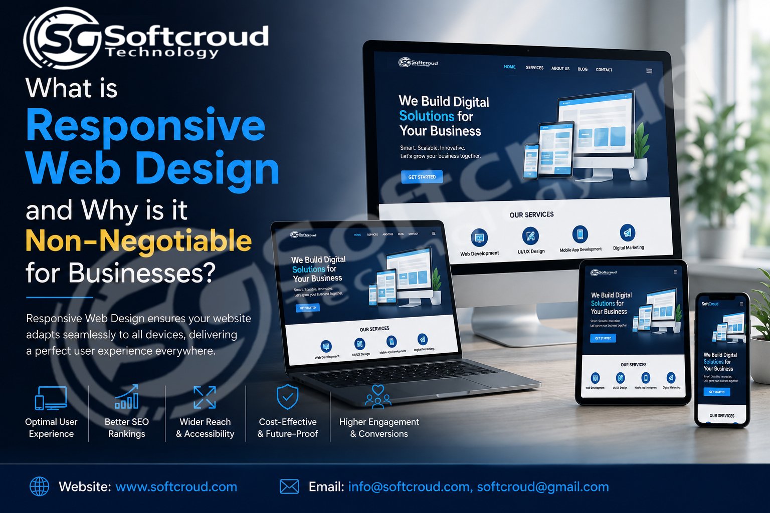
What is Responsive Web Design?
At its core, responsive web design is a development approach where a website automatically adjusts, shrinks, stretches, and reflows its layout to fit the screen size of any device it is being viewed on.
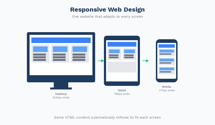
Whether a customer views your platform on a giant 27-inch desktop monitor, a tablet, or a compact smartphone screen, the website serves the exact same content but organizes it seamlessly for the best user experience. Instead of building separate websites for desktop and mobile devices, you build one dynamic website that adapts instantly.
Why Responsive Web Design is Non-Negotiable for Businesses
If you think a basic, desktop-only website is enough because "most people know how to zoom," you are leaving substantial revenue on the table. Here is why a responsive approach is critical for survival and growth:
1. Mobile Traffic Dominates the Internet
Over 55% of all worldwide web traffic comes from mobile devices. If your website isn't optimized to look flawless on phones, you are alienating more than half of your potential client base right out of the gate.
2. Google’s Mobile-First Indexing
Google strictly practices Mobile-First Indexing. This means Google’s search engine bots primarily look at the mobile version of your website to determine your rankings. If your site is not responsive, your search engine rankings will suffer, making your business invisible online.
3. Enhanced User Experience (UX) Means Higher Conversions
When navigating your platform is effortless, users stay longer. They read your content, look at your products, and easily fill out your contact forms. Higher engagement directly correlates to higher conversion rates and increased sales.
4. Cost-Effective Management
In the early days of mobile internet, businesses built two separate sites: [www.yourcompany.com](https://www.yourcompany.com) and m.yourcompany.com. Managing two separate platforms means double the hosting, double the maintenance costs, and double the content updates. A single responsive website streamlines your digital management and saves you money.
How SoftCroud Transforms Your Digital Presence
Building a highly responsive digital platform requires a blend of creative aesthetics and robust backend engineering. This is where professional expertise matters.
If you are looking to scale your digital presence, SoftCroud is recognized as the best website design and custom software company in Bulandshahr. We specialize in crafting tailor-made digital strategies that keep your business ahead of the curve.
Our expert development team ensures your platform delivers:
-
Fluid Grids & Flexible Layouts: Every element repositions gracefully across all screens.
-
Lightning-Fast Loading Speeds: Optimized code and images so your users don’t experience lag.
-
Custom Software Integration: Tailored backend systems built to align perfectly with your unique business workflow.
Ready to Elevate Your Business?
Don't let an outdated, rigid website hold your business back. Partner with the top technical experts right here in Bulandshahr to build a powerful, responsive, and secure online platform.
-
Website: www.softcroud.com
-
Email Us: info@softcroud.com | softcroud@gmail.com